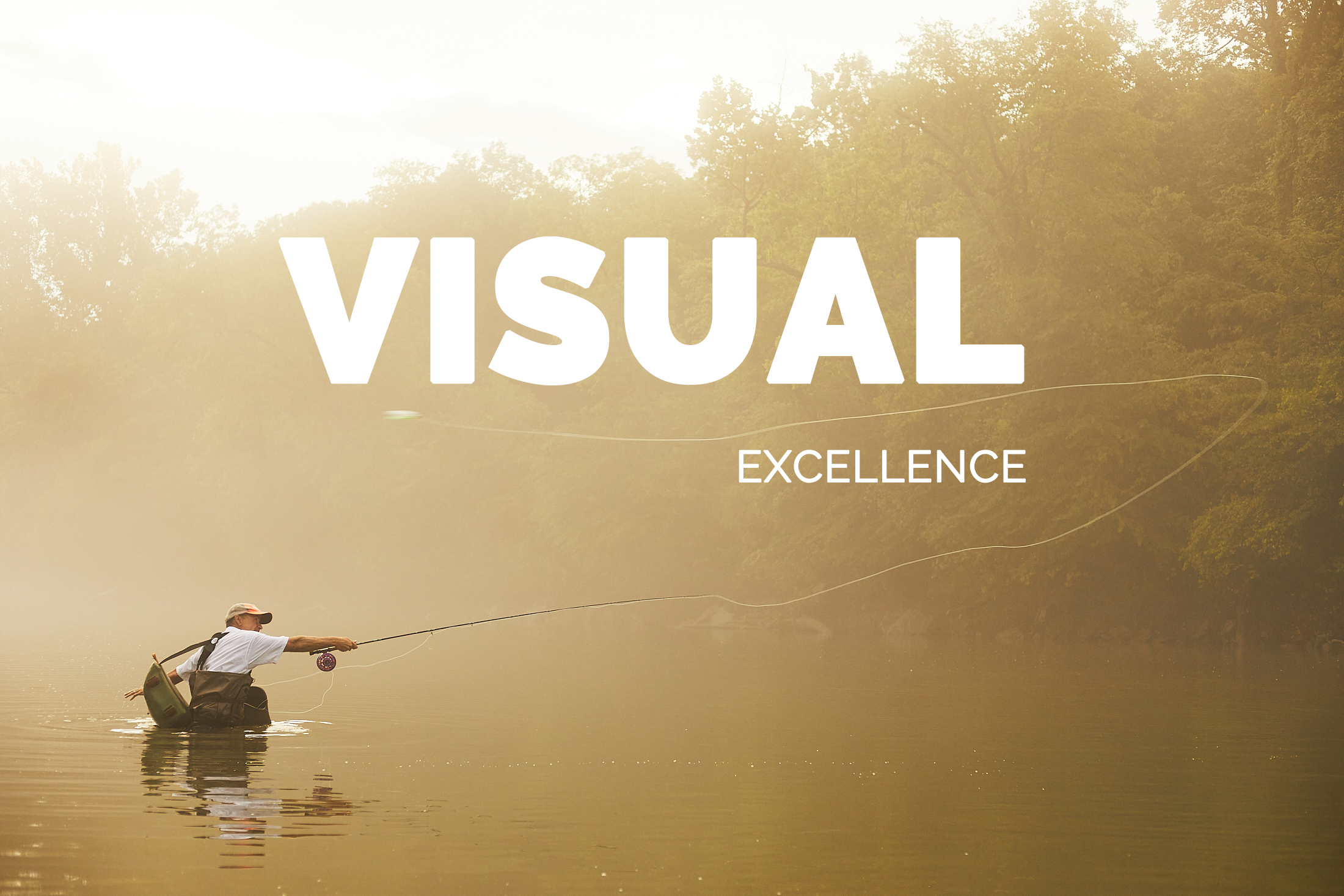
I pride myself on storytelling through visual excellence. There's a never ending stream of outdoor media but what elevates a story tends to be the money shot, combined with a relatable angle. Hunting and fishing are rapidly evolving and BHA content needs to be a leader in content to inspire and have the ability to truly fulfill the public land access mission. Through an entreprenurial spirit and a deep desire to tell the public land story with a high level of artistic ability I want to take BHA video and graphics to new levels. I'd love to build on what's existing, refining the results to make a visual product that truly connects with our audience. More than anything right now people want to find fellow travellers on their journey and through cinematic yet approachable video pieces and well executed design we can make that connection.
I have worked for as a creative for the majority of my working life, from self directed projects to large agency shoots leading a team of 15. I have a huge passion for the farm/field to table movement and create recipes regularly for many brands centered around the ideals that push sustainable eating. As an adult onset hunter and lifelong angler I have a desire to learn about people's stories that I share outdoor spaces and invite viewers along for that ride. I feel like BHA has a very unique network of people passionate about the outdoors who could create a very compelling larger plot arc that would inspire anyone watching. From public land cleanups to culture building meetups and every type of hunt possible.
I have a full understanding of all Adobe products and have used them extensively in video, photo and graphics projects as well as the industry standard Capture One for processing raw photos. I also have done the majority of the music composition for my projects as well, to insure that the result is unique and particular to each story. I use guitars, keyboards and computer composition to arrive with the vibe intact. I'm a quick editor and have learned over the years to trust my instincts and not overwork the details. Everything in the end answers this key question: "Did this element serve the story?"
From run and gun single DSLR productions to cinema cameras with a camera assist pulling focus to audio mixing and a single mic I have all the skills to achieve the best results possible for BHA. I love the interview process and getting to know people through questions, making sure to leave space for their story but always coming back with questions that solidify ideas. Below I'm leaving some of my most relevant video and design projects but have much more to share as needed.
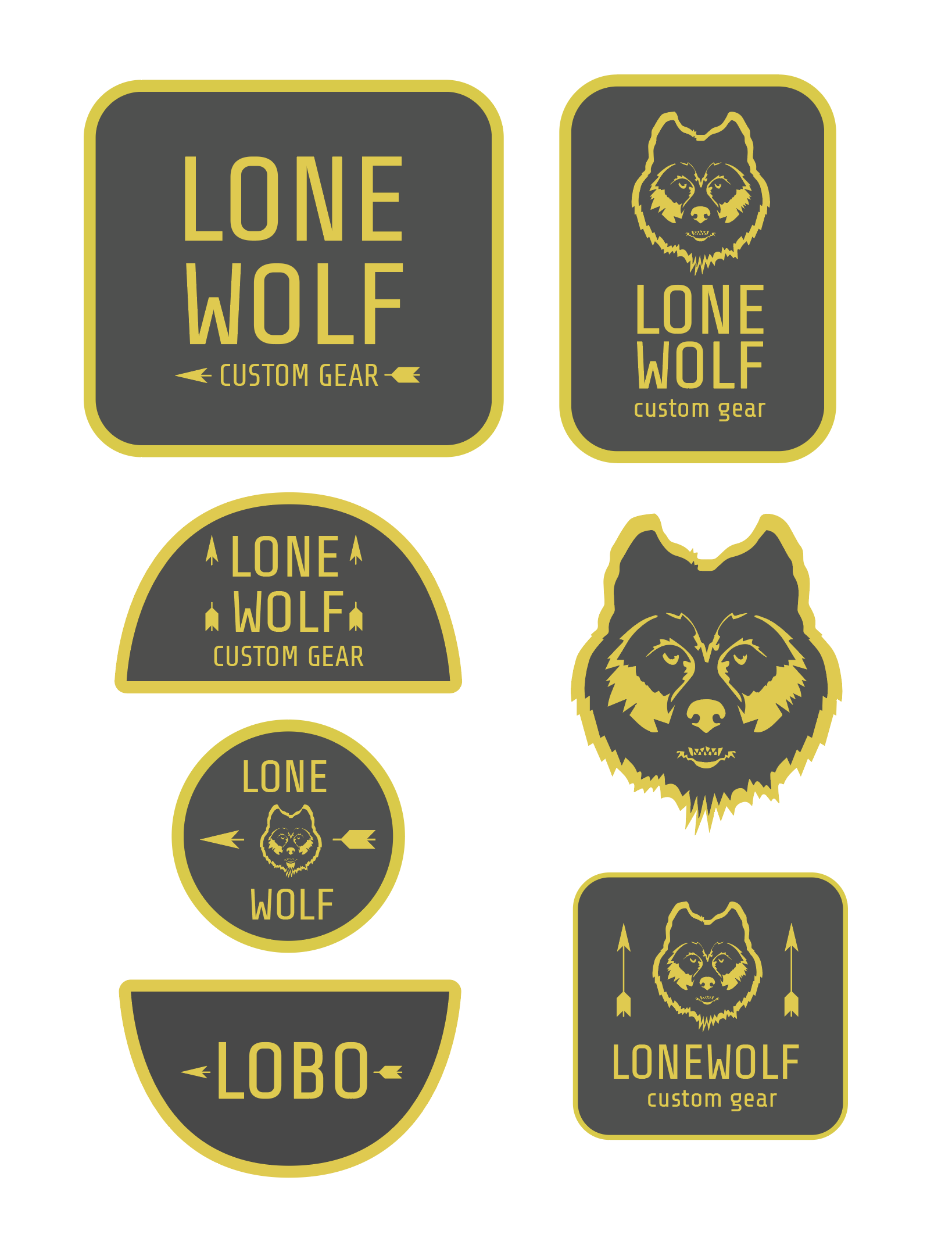
I worked with Lone Wolf Custom Gear to concept a new round of patch hats, based off of the aesthetics of classic park ranger patches and a simplified Lone Wolf logo. That project is a work in progress.
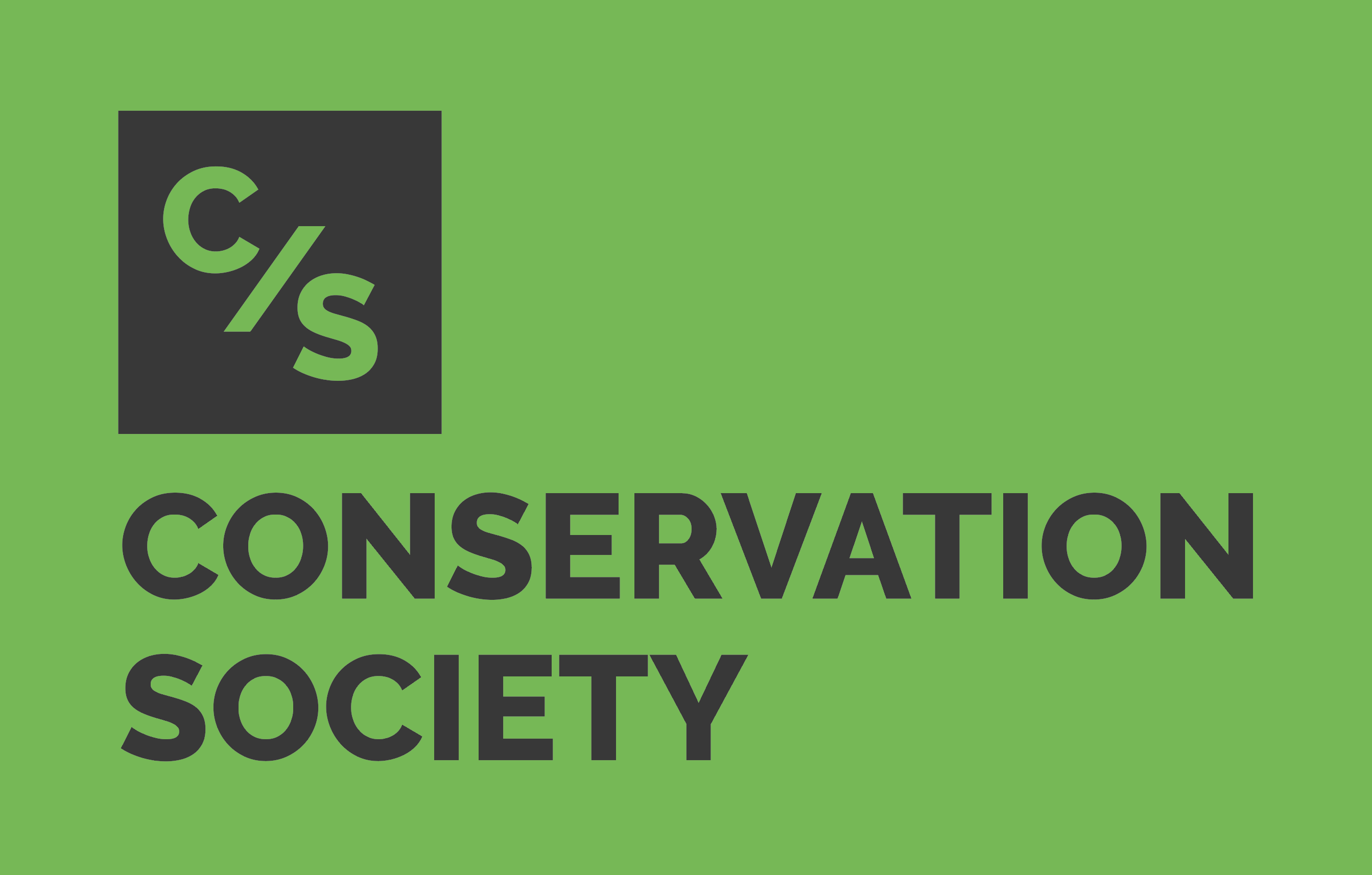
Conservation Society is a youtube channel I've started to slowly build on the side and created a logo that communicates the connection to nature while appealing to a more artful and urban demographic. Clean and classic sans serif fonts with considered colors dominate the aesthetic with plans to migrate the design to t-shirts and hats in the coming year.
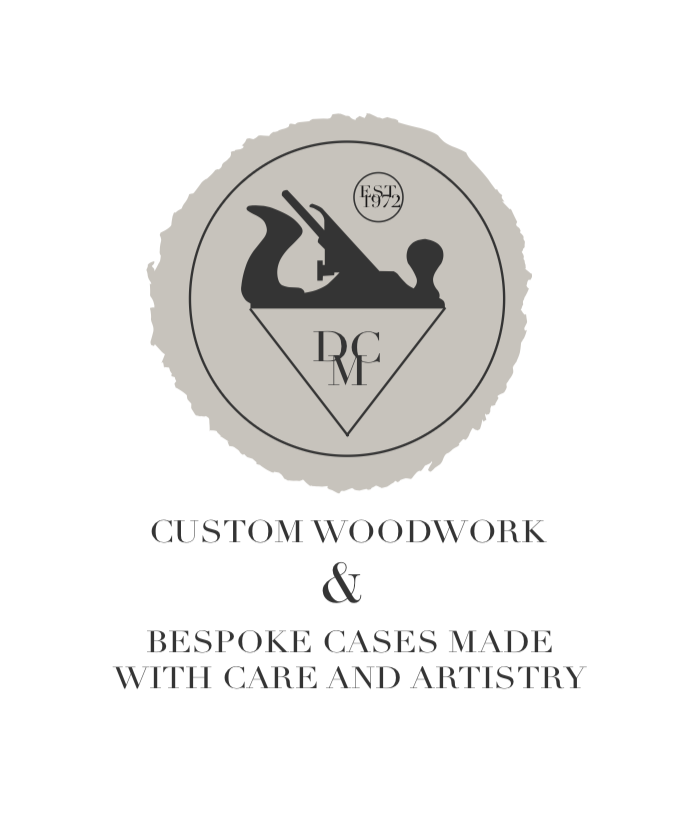
DMC Woodwork is a small job shop in Iowa run by my father. He came to me looking for guidance in refining his brand. Being a master carpenter with a life of experience he wanted to connect to that heritage but also feel relevant to younger customers that were his current clients.
I spent a few years working with various small run music technologists to refine how their products looked and worked. Interface design is about helping people really see how a product works and experience it properly. I also was establishing visual guidelines and style guides to be used across their product lines and overall brands. Working with physical objects I learned about different printing processes, manufacturing and production scheduling. I was an invaluable resource to help these small niche brands reach a larger audience by projecting quality in graphics and finish.
Resume
Pilsen Photo Co-op / Creative Lead / 2018-present
Leading a small team of creatives producing video and stills content in the outdoor, travel and food industries. From writing and executing wild game recipes to planning and producing multimedia content to client communications and presentations I've used every facet of my abilities to create high level productions. Delivering the highest value possible for the production budget I found ways to creatively soundtrack, edit and create video/stills hybrid products that help our clients have a rich viewing experience for their audience.
Clients of note: Hunstand, Worksharp, Made with Meat!/AOB, Visit KC, Visit South Dakota, MMGY, Iowa DNR, Fox & Pearl, MO BHA Chapter, Kansas City Magazine, Feast Magazine, Esquire.
Nordstrom.com / Product Photographer / 2018-present
Freelance/flex postition during high volume seasons shooting high end apparel to exacting standards in repeatable fashion. Worked with main studio manager in Seattle to formalize product videos and elevate simple videos to communicate quality to consumers. Refined lighting setups to improve consistency and workflow speed for efficiency including set building and modification.
Caleb Condit Photography / 2004 - 2018 / Chicago/Madrid/Minneapolis
Lead Photographer / Business Owner servicing fashion, editorial, food and music clients with photo, video and design output. Utilized writing and presentation skills to land clients, communicate creative goals for pitches and garner confidence from creative partners. Led with an entreprenurial spirit to find new projects in a rapidly changing business environment in 2 countries and 3 major cities.
Clients of note: CS magazine Chicago, Vice, Jose Cuervo, Tendencias, Cut Copy, Pitchfork media, Tasting Table, Refinery 29, Trunk Club/Nordstrom.